
The digital processing of invoices is becoming increasingly important—and at the same time more complex. With DocBits, the automation of e-invoices becomes simple and reliable.
The digital processing of invoices is becoming increasingly important—and at the same time more complex. With DocBits, the automation of e-invoices becomes simple and reliable.

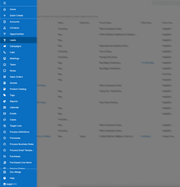
DocBits helps you organize your email communication efficiently and reliably. Automated email templates ensure that notifications reach the recipient correctly and are optimally tailored to

Modern document processing must be flexible—because every user works differently. With the user settings in DocBits, you can tailor the application to your personal requirements,

Wer kennt es nicht? Dutzende Dokumente, unzählige Uploads, ständige Fragen nach dem Status von Dokumenten – und mittendrin das Gefühl, den Überblick zu verlieren. Genau

More Precision, Transparency, and Flexibility in Document Management enhancements designed to further streamline document processing and approval workflows. These updates give organizations greater control over
You are currently viewing a placeholder content from Vimeo. To access the actual content, click the button below. Please note that doing so will share data with third-party providers.
More InformationYou are currently viewing a placeholder content from YouTube. To access the actual content, click the button below. Please note that doing so will share data with third-party providers.
More InformationYou need to load content from reCAPTCHA to submit the form. Please note that doing so will share data with third-party providers.
More InformationYou need to load content from reCAPTCHA to submit the form. Please note that doing so will share data with third-party providers.
More Information